Color is one of the first elements we register in a space, even before we consciously recognize objects or layout. It quietly sets the emotional tone of a home and influences how the body responds within it.
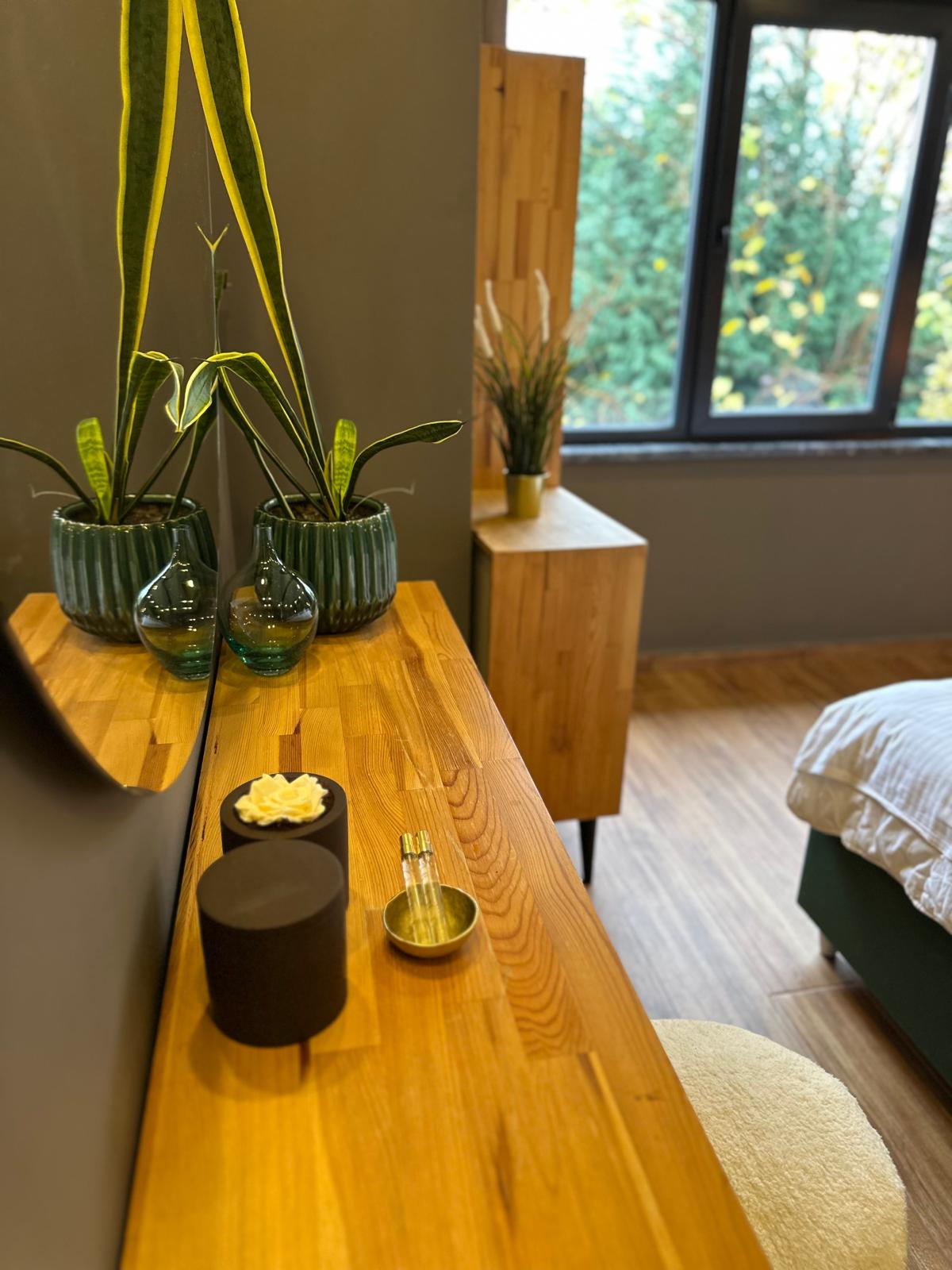
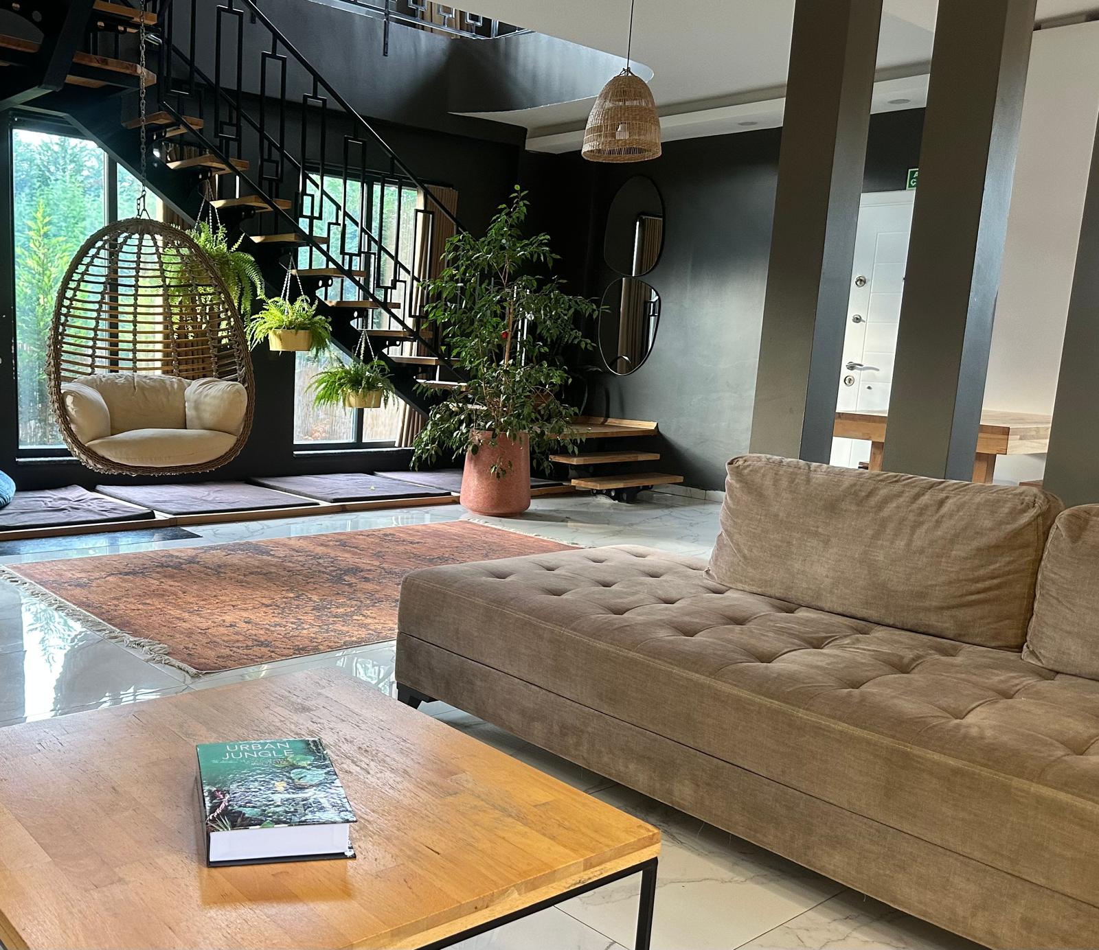
Soft, muted colors tend to calm the nervous system. They reduce visual tension and allow the eyes to rest. This is why gentle neutrals, warm beiges, and balanced pastels often create a sense of ease and openness.
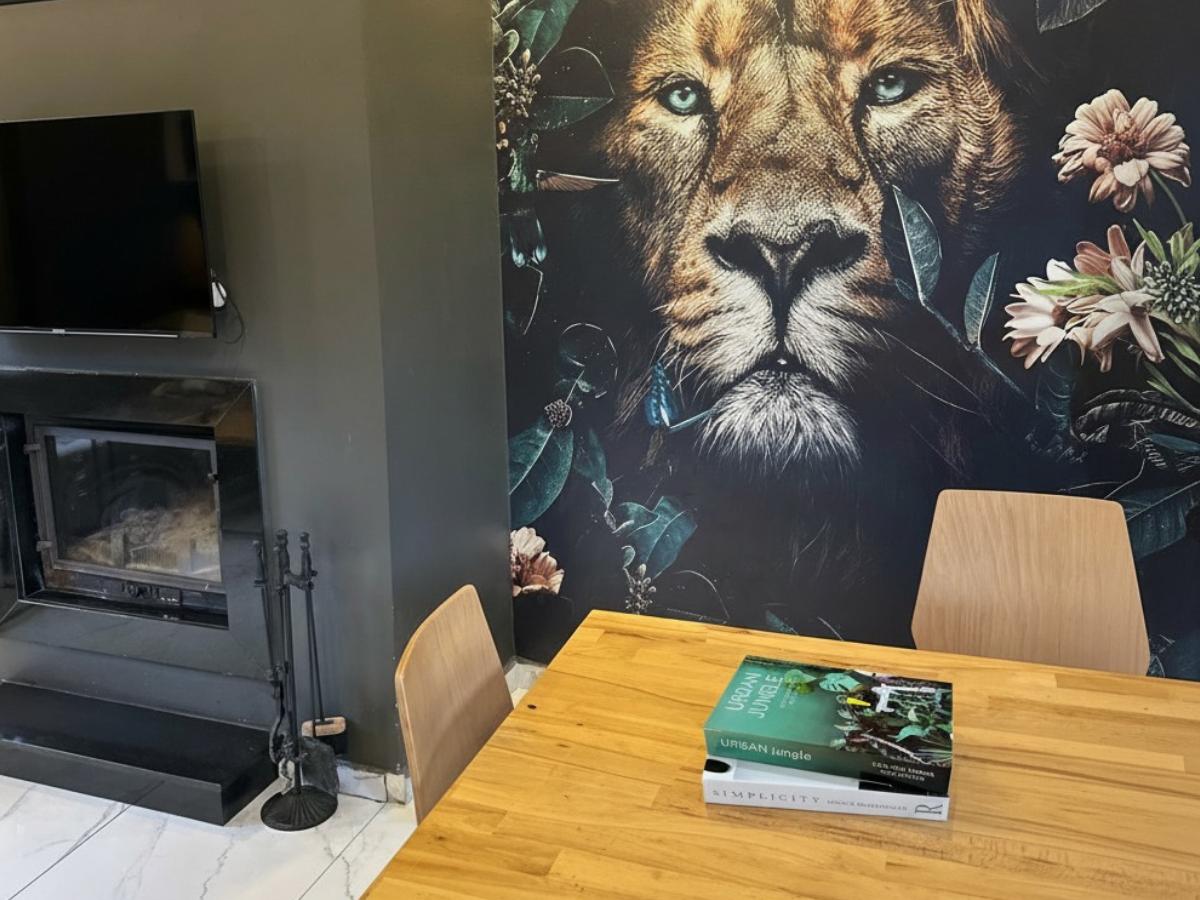
Highly saturated or contrasting colors demand attention. While they can energize a space, prolonged exposure may increase mental stimulation and fatigue. In areas meant for rest, such intensity can interfere with relaxation without being immediately obvious.
Color also affects perception of space. Lighter tones create a feeling of openness and air, while darker shades can feel grounding or enclosing depending on how they are used. When balanced thoughtfully, both can support emotional comfort.
Consistency matters as much as choice. When colors flow naturally from room to room, the home feels coherent. Abrupt shifts can create subtle disruption, making spaces feel disconnected rather than unified.
Emotional atmosphere is not created through trend-driven palettes.
It is shaped through awareness of how color interacts with light, texture, and daily movement.
A well-considered color story allows a home to feel supportive rather than stimulating — a place where the senses can settle and the mind can slow down.
Yorum yazın
Bu site hCaptcha ile korunuyor. Ayrıca bu site için hCaptcha Gizlilik Politikası ve Hizmet Şartları geçerlidir.