Color choices at home are rarely accidental.
Long before we think about trends or harmony, we respond emotionally to certain tones. Some colors calm us instantly, while others quietly create tension — even when they look beautiful on the surface.
These reactions are not about taste alone. They are shaped by emotional tendencies, sensitivity to stimulation, and how we process our surroundings. This is where zodiac energy can be viewed not as prediction, but as a gentle lens for understanding preference.
When color aligns with emotional rhythm, a home feels supportive rather than demanding. It becomes easier to rest, focus, and feel settled within the space.
Color interacts directly with the nervous system. It influences how quickly the eyes move, how the body relaxes, and how safe a space feels over time. For this reason, different energy tendencies naturally respond to different palettes.
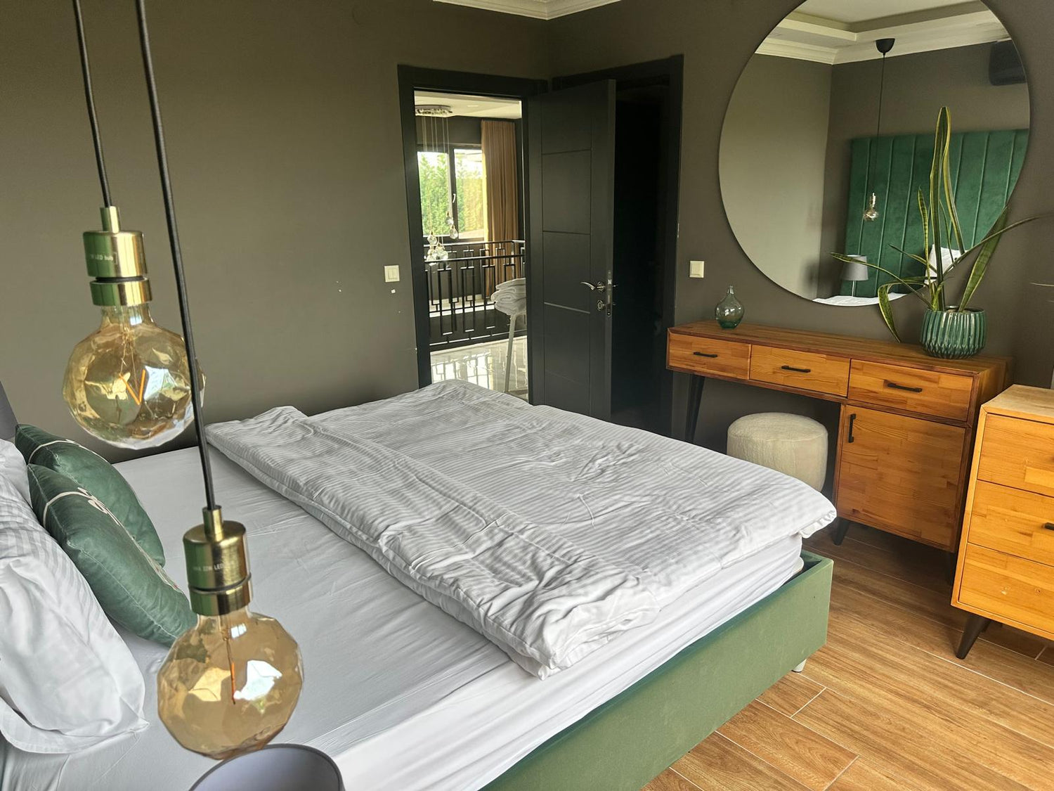
Water signs such as Cancer and Pisces often feel most at ease in environments where colors are soft and muted. Pale neutrals, gentle pastels, and layered tones help create emotional safety. These spaces feel enveloping rather than exposed, allowing sensitivity to soften instead of heighten.
Earth signs like Taurus, Virgo, and Capricorn are often drawn to grounded, natural palettes. Warm beiges, stone tones, and earthy neutrals support their need for stability and continuity. In these spaces, calm comes from predictability and visual order.
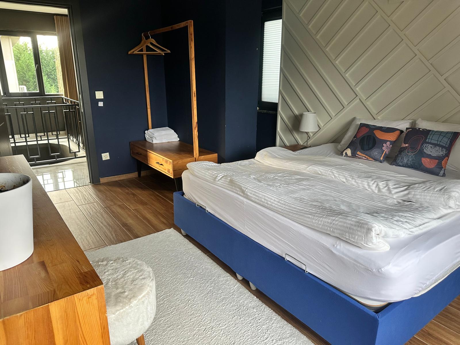
Air signs including Gemini, Libra, and Aquarius tend to prefer lightness and balance. Too much visual weight can feel mentally restrictive. Subtle contrast, breathable color transitions, and a sense of openness allow their thoughts to flow without overwhelm.
Fire signs such as Leo and Sagittarius often resonate with warmth and gentle vibrancy. They feel supported by color that energizes without dominating — tones that bring life into a space while still allowing rest.
These tendencies are not rigid categories. They are emotional inclinations. When color choices acknowledge them, the home begins to feel emotionally fluent — responding to the people within it rather than asking them to adapt.
At EVA HOME WORLD, color is approached as atmosphere, not decoration. The aim is not to impress, but to support emotional balance quietly and consistently.
Color works best when it listens.
When chosen with awareness, it becomes a background that holds daily life gently — never distracting, never overpowering, always present.
Sometimes, the most supportive spaces are the ones that feel natural the moment we enter them.
Yorum yazın
Bu site hCaptcha ile korunuyor. Ayrıca bu site için hCaptcha Gizlilik Politikası ve Hizmet Şartları geçerlidir.